Commentary Pages 17 - 18
Added 2024-08-25 21:15:08 +0000 UTCPage 017 - God Damned
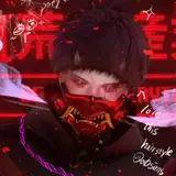
The Bastard has a very particular way of speaking.

I wanted him to feel like he talks from the edge of his throat. There’s no filtering here, he’s just spilling out whatever his id serves up on the platter. I imagined the type of game Hellfuck wouldn’t really have textboxes, so dialogue in this game is just free floating text. And it made sense to me to try and communicate the rambling cadence of the Bastard’s speech through his text placement. These dialogues were always more effort to write out compared to the rest of the page, but they were a lot of fun to make. And I think his rants would not have nearly the personality they have if they were just written out traditionally.
Peri Proclaims:
There’s an easter egg hiding in this monologue! Check these out:
Eh? Ehhh? See it? :D
Right around this time, we got the idea to have the demiurges in each game directly echo lines of dialogue stated by their counterparts in the previous game. If I’m remembering correctly, this is the first one we implemented, with Jiro’s unspoken desire to “crawl in a hole and rot” manifesting as the Bastard exacting violence of the same type on the captive Nix. I’ve seen a few sharp-eyed readers pick up on this (and on the other places we snuck it in) and it’s always very gratifying when they do!
On this page, we also get the proclamation of what will eventually become the little angel’s “name” when the Bastard declares her to be “nothing, nobody, NIX”. This was actually surprisingly hard to work into the dialogue naturally, since we want the Bastard to call her “nix” without making it seem like it was her name. It took a couple tries to get right! I also think it’s very telling that the little angel essentially allows herself to be named by her mortal enemy. It’s tempting to frame this as a power move of her reclaiming the insult, but truthfully I think it’s indicative of an even deeper dynamic: Nix truly just doesn’t give a fuck. The Bastard might think of her as his mortal enemy, but that is not a two way street. The Bastard gives so many fucks, and Nix gives zero. Sucks to suck, Bastard.


I wish I’d made this first room a little more distinctive. I should hope the blood splatters make it clear that this is the same room as the first page, but in hindsight I wish I’d put… a fountain, maybe? Just something to make it pop more in the reader’s minds as this room and not just a room. Nothing in it right now makes it stand out as a room worth remembering… it might be fine, though. One tricky thing about writing is you don’t ever get feedback from readers on what they didn’t notice, so I’ll never know if there’s any readers who didn’t catch that this is the same room as before.
There’s that crack in the wall, at least. I like in 2D platformers when they hide little secrets behind the foreground scenery, with something like a little chip in the wall to hint to you that there might be something hiding behind here. It’s a classic trick, I very much associate it with meat boy and celeste, so I think it fits right in here. I know my friend Alexi immediately identified the crack in the wall as a secret passage and grew impatient with Nix for not investigating it right away XD
Peri Interjects:
The intro to the secret room sequence also displays another key design trait of Hellfuck pages–empty space! The first draft Lum showed me of this page had all the images one after another with an even ~1cm of spacing between them. That was… well, it was fine, it got the job done, but it was definitely missing something. Adding the extra negative space between the panels brought the whole thing together–it gives us a chance to come down from the adrenaline high of the Bastard’s attack on Nix, and it gives the impression of time passing as Nix lies in place and recovers from her ordeal. And it is only after she is completely sure that the Bastard has gone that she retreats to her secret safe room.

This secret room was very much inspired by the kinds of absurd inexplicable additions that I think I especially associate with edmund mcmillen games. The random little arcades with chiptune music in The Binding of Isaac, or the 8-bit WARP ZONES in Super Meat Boy. There was definitely some pretty substantial inspiration from McMillen’s The End Is Nigh, where the protagonist even has a game console in his house you can bring cartridges to. The arcade machine felt like a good fit for a game like this, as totally absurd and out of place as the sawblades, no effort to disguise its purpose, it’s simply the thing that it is because it is. The original plan for this little hideaway was for it to be a maximally inexplicable games room, complete with tacky bowling alley carpet and a row of lights winding round the ceiling. That might have been too much, though, so I went with this cozy little dilapidated backroom instead. I wonder where that graffiti carved into the wall came from? Do you think Nix put it there? Or was it there from the very beginning, like the arcade machine and the saws and everything else?

Look at that tiny lil smile! Initial intention here was for her to have a neutral-but-interested expression here. I wanted to save Nix’s first onscreen smile for later, which we’ll get to, and I liked her being a lil more inscrutable at this time still. But… when drawing her mouth, this tiny smile emerged from the lines I was drawing and deleting, and it struck me as a real nice touch for the page. This’ll happen to me sometimes, I’ll add a detail that was maybe unintended, maybe a ever so slightly “out of character” for lack of a better term, but it adds so much depth to the scene that I just can’t leave it out.
Peri Ponders:
I never realized that Nix’s smile here was a serendipitous accident. Truly, I can’t imagine this page without it. It lends her so much humanity after we’ve seen her be nothing but silent and stoic all chapter. Just goes to show–sometimes what a story needs most is only revealed during the act of its creation! And that’s why sometimes you just have to dive in and start makin’ stuff :)
Page 018 - Last Man Standing
I really liked the bit of delicate, little Nix starting up her videogame and it’s just indiscriminate wanton murder. I don’t know if the bit lands as well as I’d hoped but it’s there, in my heart.
In any case, who cares about that. Time for CLIFF MASON, BABYYY
Peri Hoots and Hollers:
CLIFF MASON, BAY-BEEEEEEEEEEEEEEEE

The name “Cliff Mason” was a Rhys original, predating Foreach by a long shot. Rhys liked coming with cheesy names for hardboiled action heroes, Cliff Mason was one of a suite. After coming up with the Foreach character, I requested to use one of his prized actionguy names here, on the principle of if not here, then when?
The design of his suit was a process. Actually hey, let’s bring up some old concept art courtesy of Rhys:

These were some earlier iterations on the suit, much more detailed. You can see a skeleton theme on the light strips here– this is in reference to an earlier version of Rex, who would have been a skeleton-ghost. A bit of history!
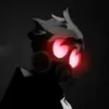
As time went on, we refined the design. Rhys changed the shapes on the light strips to match the current Rex design, and then I eventually simplified a lot of the shapes involved in the suit to be easier to draw in large quantities. The silhouette changed a bit to be less top heavy, mostly in the change from a fishbowl helmet to something more form fitting.
As fun a look as the fishbowl helm is… I felt like you shouldn’t be able to see Cliff’s entire head while he’s fighting, especially after we decided on the long hair for him, and an opaque fishbowl just didn’t feel very “action hero”.Part of my thinking here was startlingly short term. I wanted Cliff’s long, luscious locks to be a reveal that hits a few pages after his introduction, so I could stagger out the reveals of Cliff’s elements as a character. On this first page, I don’t want you to know he’s a complicated guy under there– I want you to see the soldier, and only the soldier.
(Also. Let’s be real: a head-concealing helmet is a lot easier to draw.)
So, then, what should his helmet look like? I took a few cracks at it.

Here’s a version that would have had his whole face out. That way he can still be expressive, but there’s still hidden aspects in there. Frankly, though, this one I just couldn’t get to look right. It was hard to figure out how his head should be positioned in there! Even looking at this I cringe a bit because the connection between his head and neck there is jank as hell, and I woulda been wrestling with this every time I drew Cliff. Augh! I wanted to make it easier on myself, so attempt two:

It occurred to me that all the best spacesuit shooterguys have some kind of iconic silhouette to their helmet. Master Chief has that cap brim thing hanging over his visor, Samus Aran has a wide ovoid thing with those bumps on the side and the triangle bottom… I wanted something like that for our man, so I wouldn’t just feel like a totally generic spaceman. My first try at that was this samurai helmet style V-shape thing he’s got stapled to his forehead. An alright first attempt, but it’s not great, maybe a little too tacked on.
What I went with was a Peri suggestion: antennae!

The idea here was they were meant to sorta evoke Rex’s pointy dog ears… But more importantly, they did a good job of giving him a unique shape, and that’s what I was after for the character. Naturally, I also de-rounded the top of his head to make him look less Bald. That’s an important consideration for helmet guys.
Peri Pesters:
Don’t let Lum fool you. The helmet looking like pointy dog ears was VERY important.
The decisions I made with the helmet here did have an impact on the range of expressions Cliff is able to show. Something I figured out awhile ago is that covering different parts of a characters’ face will have an impact on their emotional range– eyes by themselves convey a different range to mouths by themselves convey a different range to both. Cutting off his mouth here means there are emotions he’ll struggle to convey when his helmet’s on: he can’t laugh, he can’t grimace, he can’t yell. Fortunately, these are all emotions that aren’t a huge part of Cliff’s toolkit, so we can do without them. Compare with a character like Sunny– she would really struggle to convey the emotions she needs to if she couldn’t open those chompers wide!
Peri perorates:
Overall, I’m really pleased with the final iteration of Cliff’s design. It strikes a nice balance between being fairly simple to draw (especially on more zoomed out panels, you can see just how little detail the suit needs to actually convey the idea of “space marine suit”) while still being immediately legible as what it is. Even moreso, I think the way the helmet restricts access to Cliff’s facial expressions ends up being a real boon for the story telling. The suit creates a start visual contrast that distances the two personas Cliff inhabits–one of the unstoppable, unfeeling killing machine, and the wannabe craft dad who just misses his family. When Cliff is fulfilling the first job, the helmet keeps his face partially obscured, keeping him at a distance both from the reader and from his internal life.
It still leaves a lot of flexibility though. Eyes are the most expressive part of the face, so when we need to see the man behind the mask Lum gets a LOT of mileage out of just showing those. Going the other direction, the visor means that Lum can use techniques like light reflections to entirely obscure Cliff’s face, rendering him completely emotionally inaccessible in dramatic moments. (Lum puts this to particularly good use in the Last Gun segments of Chapter 3–just go look at how many panels have one or both of his eyes obscured!) It’s a versatile tool for a character with hidden depths!
I want to touch on another design element of the page–that HUD design in the first panel! I love the cut from Nix’s eye view on the last panel of the previous page to the Cliff-visor view at the start of this one. You can almost hear the change in sound effects happen like a smash cut in an action film!
Believe it or not, the original version of that panel didn’t have the HUD in it at all. I suggested it to Lum, who was originally reluctant to add it since they didn’t want to set a precedent and then have to draw it in over and over again in subsequent Last Gun panels. But as I pointed out–that doesn’t have to be the case! In the same way that having a detailed landscape panel can function as an establishing shot at the start of a scene and then never be drawn again in detail, elements like this really only need to show up once to do their job. In this case, having the HUD also strongly implies that this is what Nix sees while playing the game, which helps make the whole premise of all these worlds being games feel a little more tangible.
Comments
I wonder if I was subconsciously influenced by that...?
Lum
2024-09-26 12:11:34 +0000 UTCThe Samurai Shaped V in proto Cliff's design makes me think of the Gundam V-fin, which was also inspired by samurai.
Dr. Psyche
2024-09-21 09:35:08 +0000 UTCThe first iteration of Cliff reminds me a lot of the Caliban from LANCER.
Elisabeth Latini
2024-08-25 22:06:19 +0000 UTC