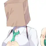
Do You Like The New Lettering Style I'm Using In Friendly Experiment?
Added 2020-09-17 09:11:12 +0000 UTCI've made huge changes to the lettering (the process of putting words on the renders) in these years.
- First of all, with Pandora's Box, where I've switched to using Comic Life 3, instead of Photoshop.
- Then, I've removed most balloons tails in Couple's Kindled Kinks, because it looked cleaner, and the color of the word balloon explains who's talking.
- Then, I've switched to squared word balloons in Hectic Crystals, instead of round ones, because they looked cleaner to me, and they are more optimized space-wise.
- Now, with Friendly Experiment, I've removed the tails even between word balloons. It takes a bit more time to letter each page, but it looks even cleaner to me.
I've never been interested in following standard comic lettering rules.
I'm more interested in having clean and clear lettering, with an original look.
I'd like to know what you think about this new change, and about my lettering in general.
Feel free to comment or to message me if you have any suggestion!
Comments
Thank you for your answer Delicurious! :D It has just started, and I'm trying this new lettering style, it'll come to the TG Lover tier as well!
LenioTG
2020-09-17 21:49:54 +0000 UTCI don't have access to this comic, so I can't answer your question.
Delicurious
2020-09-17 16:37:48 +0000 UTC