Sandbox Menu Style Poll
Added 2024-04-09 17:15:03 +0000 UTCWhich one do you like!?
EDIT: THIS MENU IS ONLY VISIBLE DURING THE ANIMATION AND CHARACTER SELECTION PROCESS, IT CAN BE HIDDEN DURING SANDBOX GAMEPLAY <3
EDIT 2: Heyhey, Helltaker here. So I noticed that maybe there might be some misconceptions with how the characters are presented in these images. Usually the Sandbox will not be played in a "test environment" like you can see it here, means the characters as you can see them right now are loaded in dynamically IN POSITION as soon as you select a animation and drag characters into the role section. Its probably a bit hard to understand right now but do peek into the spoiler section of our development discord or ping me if you want more detailed showcase on how the functionality works.
Or check out this preview I made in a rough layout today.
https://gyazo.com/e4d100adf7eb5f39090394e338da46f8CHEERS <3 And thanks for the feedback so far!
EDIT 3: Since 2 is very much ahead at the time, check out this nice preview of how it can be collapsed in game!

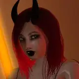
1.
 2.
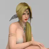
2.
 3.
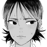
3.
 4.
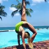
4.

Comments
Its currently via Q in exploration areas of the game. Next update will make it a LOT easier to find though (with screen icons telling you what to press when its available).
Big Bang
2024-04-13 13:50:00 +0000 UTCI don't even know how to find the sandbox. Sadge
Tony 🔔
2024-04-13 11:17:20 +0000 UTCOne issue I see with all of them is that the animations are listed only by name, with no real space for a description or visual indicator. Position names aren't always intuitive (ex: "crouching tiger" gives no info, and "pegging" usually involves a strap-on), so a basic visual would help a ton. That could be solved with a mouse-over tooltip, with generic silhouettes (or stick figures) showing the position and maybe a text list of the roles, but I'm not sure if that's the best option. As for these current options, they each have pros and cons. This is my take on each: 1 gives more visual information, and lets you see more of the lists at once, but it feels quite crowded. It does look the most like an "editor view", and is the only one with room to give info on each animation, but the way the parts are disconnected makes them seem separate. 2 shows the logical progression of "anim">"character">"role" well, but it makes the anim and character lists too small and would probably be cumbersome. This one also feels like it wastes the most space on the screen. 3 looks like a decent middle ground, but since the "roles" differ for each animation, so choosing the animation and going back up to pick "roles" seems counter-intuitive. 4 is a more logical order, doesn't feel "in-the-way" as much as 2, and is probably the best of the four, but the animation list still feels a bit cramped.
sciencetiny
2024-04-11 22:08:50 +0000 UTCCheck out what we are showing off on a iteration on 2 in the spoiler section of the development discord. The entire interface is collapse-able :3
Big Bang
2024-04-11 14:33:00 +0000 UTCOption 2 looks like a subverse interface which is very inconvenient
Kafka
2024-04-11 05:26:57 +0000 UTCIt's seems so poor, u can put the characters in a circle in some poses and scroll through it when choosing an actor. this will free up space on the sides and the rest of the options will look appropriate, and with interface animation it will be bomb
Kafka
2024-04-11 05:25:23 +0000 UTCYeah, but boobs though 👍🏿 !
Pinepiece
2024-04-10 16:59:54 +0000 UTCPretty tough to choose which one, they each have an aspects that are good but 1 and 2 take my cake. Though I am leaning more towards 2 because it has the best view and it simply looks the best to me.
Sumeir
2024-04-10 10:18:45 +0000 UTCI'm a sneaky snek!
scjwolf
2024-04-09 21:17:52 +0000 UTCDont get caught xD
Big Bang
2024-04-09 20:09:36 +0000 UTC😅 I'm at work, excuse my grammar
scjwolf
2024-04-09 19:00:25 +0000 UTCPlease check edit 2 above <3
Big Bang
2024-04-09 18:52:45 +0000 UTCI like being able to see all of their faces first honestly.
Pinepiece
2024-04-09 18:42:19 +0000 UTCCheck the edit comment on top <3
Big Bang
2024-04-09 18:06:20 +0000 UTCyeah i'd personally rather see the pussies than the boobs but ig
ws04
2024-04-09 17:58:15 +0000 UTCHonestly, I think the first one is better. It would make for more fluid use of the menu. I feel like option 2 is winning simply because of boobs lmao
scjwolf
2024-04-09 17:48:03 +0000 UTC