![[活動報告]色塗り方法について part2 影&グラデーションを修正しました](https://img5.nokimo.com/storage/1/wd/jz/fb3178-019e8b14-ebbe-79f6-9af6-68f458b6c8f7.png)
![[活動報告]色塗り方法について part2 影&グラデーションを修正しました](https://img5.nokimo.com/storage/9/pa/uv/fb3178-019e8b2b-b332-7a13-b53c-21be42796640.png)
![[活動報告]色塗り方法について part2 影&グラデーションを修正しました](https://img5.nokimo.com/storage/5/cw/hn/fb3178-019e8b14-ebce-7305-9e94-5b9bd652c6d3.png)
![[活動報告]色塗り方法について part2 影&グラデーションを修正しました](https://img5.nokimo.com/storage/5/wz/bq/fb3178-019e8b14-ebce-75ef-a1f3-50f5276e44bc.jpg)
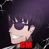
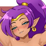
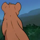
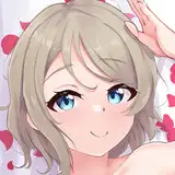
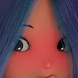
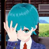
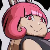
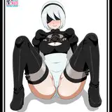
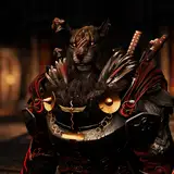
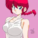
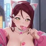
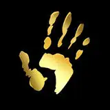
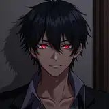
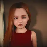
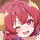
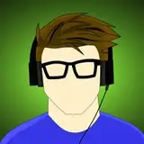
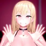
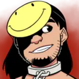
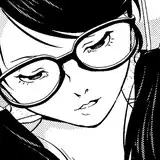
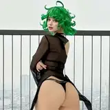
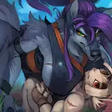
影とグラデーションを修正して、前回よりも更に深みのあるイラストに仕上げてみました! 今までは少しビビりながら細かく影の色塗りをしていたんですが、光源を意識しながら大胆に大きく塗ってみた結果、前回の時と比べてかなり引き締まった色合いになったかと思います。 後、髪の光沢の表現と鼻を修正したのと、過去に少しだけ取り入れていた、線画にちょっとしたクセを足して意図的に情報量を増やす表現も再び導入してみましたが、良くなったかは不明です💦 ちょっとした欠点として、今までより製作時間が少しだけ増えてしまいましたが、効率化を図って対策していこうと思います! まだまだ改善できるポイントがあるかもしれませんが、とりあえずこの方向性で色塗りをしていこうと考えていますので、何か意見等がありましたら是非コメントして下さい。 よろしくお願いします! I've modified the shadows and gradients to give the illustration even more depth than last time! I used to color the shadows in detail with a little bit of trepidation, but I painted them boldly and largely while being aware of the light source, and I think the result is a much tighter shade compared to the last time I did this. I also corrected the glossy expression of the hair and the nose, and I also reintroduced the expression that I had used a little in the past to intentionally increase the amount of information by adding little quirks to the line drawing, but I'm not sure if it improved 💦. One small drawback is that the production time has increased a little more than before, but I'm going to try to improve the efficiency of the process! There may be some points that can still be improved, but for now, we are thinking of coloring in this direction, so if you have any opinions, please feel free to comment.