Hey guys!
WOHOO! IT'S HERE!
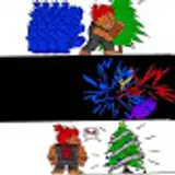
After many failed attempts, I present to you No North’s final page design!
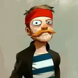
This is a deleted scene from the original script. I’ll probably keep it for upcoming books, but it served perfectly for the test!
If you remember the last page test I shared with you over two years ago (THAT LONG), you’ll notice a few core differences.
The page no longer has borders. I wanted them to feel “endless”, like a view or a landscape, unrestrained. Freedom is one of our biggest themes here, so I though this went along well.
The closeup panels “float” over the main ones. And the main ones merge into each other like a painting. Color has always been one of my priorities, and much of the storytelling will be done through them. I just thought this would be a good way to value them hues.
Characters pop out of the panels, while keeping it as clean as possible and not affecting the reading experience. Again, I’d love for the pages to not feel “restrained”. They’re also rarely square, keeping it adventurous.
The font is easier to read, all letters are clear, and it still keeps that comic book feeling to it. It took me ages to find one that actually worked!
I think these are the main points of what I’m aiming to accomplish on every page of the upcoming comic. I would absolutely love hearing what you think of it, and if you have any pointers/suggestions!
It means a lot that you’re all with me on this. You’re great. I hope you have a super awesome weekend!
DoggieDiversity
2019-10-11 18:47:19 +0000 UTCFozzy
2019-10-11 18:20:21 +0000 UTCThe Stormberry Cloud
2019-10-11 17:22:41 +0000 UTCKiara Kalmey
2019-10-11 11:57:27 +0000 UTCLombarsi
2019-10-11 11:35:56 +0000 UTC