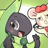
probably, otherwise a more complex ai would be really confusing.
Syvaron
2018-03-09 18:48:58 +0000 UTC
Do you plan to make small battle animations? nothing too fancy, just some basic stuff
2018-03-09 18:44:47 +0000 UTC
Tested, approved, but i do believe health and mana were more visible in the precedent concept.
My comment is based on gameplay while looking the whole map (so from "far away") (Which map is really smaller (good and bad))
The thing is it gets pixelated quickly and dosn't change based on the tile. Yellow (Full health) is readable, orange gets worse and red in my opinion is kind of a bad idea.
Mana and Ap are good. Light (but not green) are good in my eyes (maybe just me ~~_~~
Names are worse (highlight them ?)
How about at least puting health bares for our team on the top right corner ?
After trying to play a bit closer, i'd say only the names and health are problemes. Need a bit of time to acclimate myself :s
Arachnid
2018-03-09 15:26:56 +0000 UTC
ohh me likey
FossorTumulus
2018-03-09 07:43:46 +0000 UTC
Nice work.
2018-03-09 01:48:54 +0000 UTC
Exquisite!
Ghostflame
2018-03-09 01:05:15 +0000 UTC
I like it way better then the old one.
2018-03-09 00:15:01 +0000 UTC
Looks good to me :3
Too bad i won't play anymore tonight
Arachnid
2018-03-09 00:07:12 +0000 UTC
That definitely came out really well. I think I like the change to this a lot more than the old battle map design.