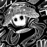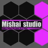
New logo
Added 2020-08-13 12:49:41 +0000 UTCHeya, also wanna try go with bit different logo :) In past I was alot inconsistent with logost and links. Chose some symbol is not so easy as may seem and when need to throw in some colors and fonts which will look cool on pictures ... damn, no wonder that PR folks take so much money:D.... Well i made this ...it is not perfect, but it will work...wanted something funny which somehow sums up main feature and general direction:D What do you think?:
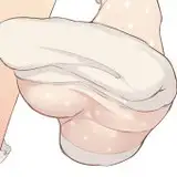
Upside version:

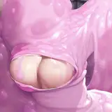
Downside version:


Comments
bottom vesion feels somehow familiar.. also must to wear glove when finaly get to them would be cruel rule :)
Mishai
2020-08-17 20:47:23 +0000 UTCMuch thanks for your opinion!
Mishai
2020-08-17 20:45:31 +0000 UTCThat's a good point :)
Mishai
2020-08-17 20:43:56 +0000 UTCUpside logo matches better with the "shape" of a torso, making the circles placement similar to breasts on a chest.
2020-08-14 15:47:27 +0000 UTCIn the upside version the triangle crowds the logo on the right and on the downside version it looks better because the logo "fits" better. I'd like the upside version better if your logo was on the bottom so it wasn't crowded.
2020-08-13 20:40:03 +0000 UTCI like the downside version, with Boobhazard at the bottom. Not sure why it's better, but it just looks right. Incidentally, if you think those boobs are a hazard, I'd be happy to handle them for you - even if I have to wear gloves!
tom jones
2020-08-13 19:55:12 +0000 UTC