Behind the Scenes: STP Lighting Preset Room (part.2)
Added 2023-01-25 20:09:09 +0000 UTCThe lighting preset rooms of STP Deluxe start from No.30 'Koi & Lotus'.

I think the main difference between lighting preset rooms in STP Standard and STP Deluxe is that, the ones in STP Standard focus on basic function tutorial, while those in STP Deluxe show the variety or possibility of STP lighting. When I designed the lighting of STP Standard, I was always thinking 'how can I show this feature in poster'. When designing the lighting of STP Deluxe, I was thinking 'what about this theme / tone'.
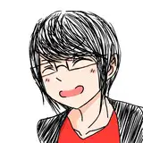
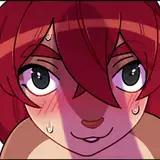
No.31 「Ceyen」


The XS size of PL Intensifier came out. And again, I needed a poster to show how small the light area could be. I viewed the poses in game as usual, and found an awesome pose by helgatisha. It would be interesting if there's a light source in front of the eyes pretending as a beam of light from Koi's eyes... or things like that. So I tried and took the screenshots.
I named it 'Ceyen' because the highlight of the poster is the cyan light from eyes, and there's syllable /aɪ/ in both of these two words. But I was not sure how would the native speakers pronounce when first see it. Anyway, at last I decided not to publish it, because the lighting effect is quite simple.
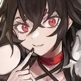
No.32 「Karma」


Shadow Intensifier would be quite useful in horror or mysterious themes. But there wasn't any STP lighting preset room of horror themes yet. So I designed one. I wanted it a little bit creepy, like the lighting in the streets in a red moon light, where demons born from people's dark lust are wandering, and Koi as a demon hunter (maybe from netherworld) walking towards them. I chose dark blue shadow and cyan as main tone, then added a purplish red light to outline Koi's face. Hope it brings the ambience of a cold creepy night with red moon.
No.34 「Crush」


After finishing No.32 'Karma', I was thinking 'what about the demons born from people's lust'. I wanted a more 'dangerous and charming' version of red moon night lighting. This time, red light coverd the right side of Koi, representing the crush from dangerous violence or maybe just love or lure. Then it turned to a weak cold light, which looked like soft dark purplish blue on the face. Then a tiny light cyan outline. So Koi was very close to the dangerous crush. Would he turn his cheek to face the crush, or turn his cheek back to leave it behind? I hoped to show this idea through the poster.

I also made a different version with light color, which I guess would be more similar to the feel of 'crush among youth'. It would be less dangerous, and more sour compared to the dark version. But I don't like this poster. There has been similar pose and angle in No.30 'Koi & Lotus'. So this became boring. I wanted to change another pose or angle, but I couldn't squeeze enough time for that 😢
No.36 「Sunglow」

I like using orange PL-hard light very much, because it looks like sunshine on the skin. I used it in No.25 'Dawn', No.27 'Rainbow', and No.30 'Koi & Lotus'. But none of them brought me the feel of 'very shiny and fascinating'. So I decided to make another one.
I chose my little household sim Koi (teen version). I placed him at the room and added some STP lights. Then I chose a pose for him and adjusted the lights' position based on the pose. But it's just barely satisfactory (pic below). I adjusted the lights again but things didn't go better. So I stopped the pose.

I was thinking 'what types of pose suit this best'. But Koi was waiting and smiling (playing idle pose of ts4 itself). I felt like I was melt by this smile and this was exactly what I was looking for -- I hadn't adjusted the lights, but this pose already suited the lighting perfectly. So I paused the game and took the screenshots directly.

The lighting in this room brought me the feel of sunglow, and fairytales in autumn, and a paused hourglass of eternity somehow. I chose 'Sunglow' as its short name and 'Shine like Sunglow' as its full name (‘‘灿若朝霞’’ in Chinese). I hope this lighting can remind people of all of the goods in their lives, and sweep all the sorrow away.


I also made some gifs. Little Koi is cute! Though he may not be cute enough compared to other sims of other simmers, he is No.1 in my mind haha ^ ^
No.37 「Melody」

I found that there were some orange and red (as primary color) lighting preset, but there was not any pink one in STP yet. I wanted it colorful, sweet, and lovely. So I would choose color with high saturation as accent color. Given the balance of color temperature, maybe green, maybe cyan, maybe blue.
Teen Koi as model again, girlish style this time. I tried the yellow green first. I thought it would be like red strawberries and green apples and pink-dress girl, a feel of cottage living. But it seemed that the yellow green light didn't match the pink light, and that the color was not clear enough, and that Koi's right hand kept his face from view.

So I slightly changed the proportion of pink and yellow light (adjust their position and intensity) to make the color clearer. I tried cyan as accent color, deleted his right forearm, and changed his eye makeup. It was much better then.

I was going to name it 'Candy'. But I didn't want that sweet. I named it 'Melody' at last, because I thought Koi would hum or whistle some melodies when in good mood, and it looked like Koi was humming melody on the poster.
No.38 「Vaporsteel」


This lighting preset room isn't published individually, it is published together with the whole STP Deluxe. I don't want to make a post for it, because the pose on the poster is actually the tweening of two poses. It may be hard for users to get the similar pose.
The other reason is that I found its lighting quite similar to No.24 'Neon'. I don't see any point in publishing a similar lighting preset room. But they do have some differences, such as the catchy cyan light in No.38, and the light positions, and so on. So I put it in STP Deluxe at last.
When I built this lighting preset room, I was hesitating about the theme. Cyberpunk or Vaporwave? I was afraid that I knew none of these well. So finally I gave up. Instead of certain theme, I wanted to show a feel of contrast between the more-and-more-lively exterior and the more-and-more-numb interior. I kept Koi's upper half of face from being covered by the colorful lights, so that it looked like Koi was going to be completely overwhelmed by them within a few seconds. Would he lost himself, or would he stay awake in the end?
The name 'Vaporsteel' came from 'vapor' and 'steel'. I thought these two brought the contrast of both material forming (gaseity vs. solidity) and color saturation (high saturation like vaporwave vs. low saturation like steel grey). It matched the idea mentioned above.
No.39 「Heatmap」


I've planned to make a poster with extremely high saturation since STP came out. And here it is. The lighting effect itself is not complicated. I chose red-to-yellow gradient color, blue, and cyan light to make it sharp and catchy like heatmap.
This kind of lighting will not be used most of the time. Still I want to show the color range of STP lighting to people. It's useful in both normal (daily) lighting and special theme lighting.
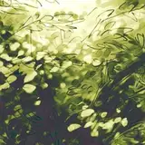
No.40 「Mint」


This time, I counted and found that there was no light green as primary color among all the STP lighting preset rooms. Green color reminds me of plants, nature, and hope. But it was difficult for me to stress green light in a natural scene. So I acted in an opposite way. I added several artificial accessories, and highlighted the eye area with tiny orange light, which hopefully lead people to stare at the artificial eyes (STP lens 'Control'). I imagined a world where everything is fresh but artificial, where people use artifact to imitate or simulate the nature. It's far from wasteland-like themes, and I didn't know how to call or summerize it. At last, I chose the word 'mint' as its name to describe the fresh cyan and green. Sorry for my poor vocabulary 😖
(To be continued)