Behind the Scenes: Thumbnail Tests!
Added 2025-12-17 09:59:44 +0000 UTCWhile I was on my break in 2024, after hitting year 3 (!!!) of Vanilla Velvet Audio, I started thinking about doing a refresh for the channel. The plan was to update my thumbnails over a few months, and have a retool of video visuals ready to go by June 2025, just in time for the fourth anniversary!
...yeah. For the most part, that didn't happen. Clearly!
But back when I was still bright-eyed, bushy tailed and full of hope/hubris -- y'know, before 2025 kinda blew up in my face like a cartoon cigar -- I started toying around with new thumbnails in secret. I didn't really announce that until Februdere, but it had been in the works for awhile.
YouTube actually rolled out a thumbnail testing feature in early 2024 to a limited number of channels. By end of the year, it was widespread enough for me to take advantage of it, and I was ready to jump in. Now I'm going to show you some of the many (manymanymany) thumbnail styles I was messing with and trying out!
But before we do that, a short walk down memory lane...
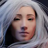
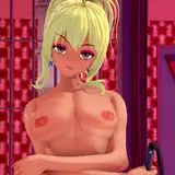
Vanilla Velvet Audio Thumbnails: Gen 1
I started my channel as a random hobby at first. I only discovered audio roleplay a month or two before it launched, and trying the art form seemed like fun that was suited to my particular interests. While I was excited to get Vanilla Velvet Audio off the ground, I was fully expecting my work to either flop or (just as likely!) I'd lose interest and wander off before too long.
At that point, I couldn't have possibly anticipated where it would go, much less that I would somehow consistently produce weekly audios for years. (With my neurospicy brain, and lifelong tendency to flit from project to project, this channel may be the most consistent project I've ever done!)
So I admit I kinda just threw together a thumbnail style to get started. I was way more obsessed with actually recording, learning to edit, and getting some decent branding elements in place. I guess I figured if it took off, I'd mess around with thumbnails and find something better later.
This is that thumbnail style...

RIP, straight-on Bangers font with color coordinated text emphasis, we hardly knew ye.
It didn't last long, just a few months. From late June 2021 - late September 2021, if I remember correctly.
Why?
Because I had some videos BLOW UP. I realized by the second video I posted -- that one, in fact! -- I needed to get my shit together pretty fast, because "eh, I guess that's good enough for now" wasn't going to be for long.
So I spent those months doing some light market research, brushing up on my graphic design, and deciding how I wanted to present my stuff. That led to...
Vanilla Velvet Audio Thumbnails: Gen 2

Hello, old friend.
You remember these, I hope! They lasted from October 2021 - February 2025, which is basically a century in internet years. I even put together a thumbnail anatomy layout guide as one of my first Patreon exclusives!

When I retooled the thumbnails from Gen 1 to Gen 2, I knew I wanted to carry over at least one design element from the original for consistency. Because they were so bare bones, the only thing that lasted was the font. Little did I know when I had initially chosen it, Bangers is one of THE big cliches in the YouTube space. Ah well.
I also focused on carrying my branding into the thumbnails themselves. I wanted viewers to know a video was me from the get-go. And I was happy with these for a long time!
What changed? Why did I start thinking about a refresh? Well, there were a few things in play.
First: my own boredom and need for novelty. ADHD is a harsh mistress. At a certain point routine feels like rubbing sandpaper all over myself. If it wouldn't destroy the channel in the algorithm, I'd probably have a new thumbnail style every month or two. I wanted a change in part just to satisfy that segment of my brain.
Second: the audio roleplay space has changed a lot in just the few years I've been here. Channels that I used to compete with (for lack of a better term) have either been kicked off the platform, changed focus, or vanished into the ether, taking the older thumbnail styles with them.
A new crop of talented VAs have also emerged on the scene, bringing with them different aesthetics, and it's made me itch for an update. Once I started seeing greenhorn channels with snazzy new fangled thumbnails, and felt like kicking my sneaker into the dirt, going, "Aw, shucks, they look so coooool..."
I knew it was time for a change.
Third, and related to above: design trends and tastes shift! Especially right now! With the widespread rise of generative AI (and get-rich-quick content farms muscling in on this niche in particular) there's a LOT out there at the moment. I gotta look my best!
And last, but certainly not least: the algorithm rules all. While I promised myself I would NEVER chase trends -- and I'm proud to say I still haven't -- the fact remains the old thumbnails were flopping for awhile. Adapt or die.
Which brings us to...
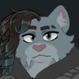
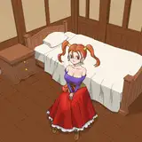
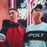
Vanilla Velvet Audio Thumbnails: Gen 3
Drumroll, please!

Tada! The end result of many designs, dozens of head-to-head tests, and a lot of finicky little refinements. Seriously, these went through SO MANY iterations, which we'll get to in a moment. (And they're not all up yet, I'm still sloooowly replacing Gen 2 now that I've got a bit more time to handle channel stuff!)
Just like the shift from Gen 1 to Gen 2, I carried over some elements from the previous thumbnail design for some consistency. This time: the solid color band, a blurred background with a character, and some Vanilla Velvet branding.
Now, if I'm being completely honest, there are things I dislike about this final design. But I ran test after test after test, and this is the style that outperformed everything else. Like, it wasn't even CLOSE in some cases.
Whether in a short test...

Or a long test...

In the biz, that's what we call a Thorough Trouncing.
The new design dominated.
It didn't matter if the audio was popular or unpopular to begin with, that particular thumbnail blew everything else out of the water. I tested it against Gen 2 thumbnails, I tested it against other new thumbnail possibilities, I tested it against itself with slight changes in text and brand positioning, on new audios and old ones, blockbusters and flops. It just TOTALLY destroyed everything in its path.
¯\(ツ)/¯ So, I threw up my hands and gave up. Sure, I'm not out of my mind ecstatic with the end result, but I know better than to argue with data.

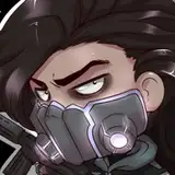
jk, that is obviously Lore
Which brings us to the point of this post: showing off a bunch of the refreshed thumbnail designs that DIDN'T make the cut. The road to the final version was long and bumpy, and you should get to see it!
Only a handful of the thumbnail styles I worked on actually made it to proper A/B testing on YouTube, and I narrowed the possibilities further with each subsequent test. For example: centered, bottom text was a clear early winner, so I nixed everything else pretty fast. When one font started hitting better numbers than others, I zeroed in on it. So on and so on.
This isn't even all of the possibilities. There were...........oh gosh, so, so many. I've lost count. But these are the ones that made it the farthest, surviving round after round of winnowing the chaff from the grain, as it were.
Without further ado...
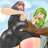
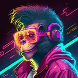
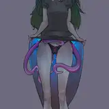
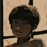
Vanilla Velvet Audio Thumbnails: Gen 3 Concepts & Tests


It's a mixed bag, for sure. I basically threw everything I could at the wall to see what would stick, or what I'd hate after letting it sit for a few days. Solid backgrounds, gradients, patterns, new fonts, new text styles, different branding, you name it, I tried it!
If the current Gen 3 thumbnail style needs an update down the line, as I'm sure it will, I know I'll be revisiting some of these ideas. There are a few things I'm sad didn't make it to the final version.
So. There you have it! A quick behind the scenes peek at the channel's thumbnail update. Or, some of it, anyway! I hope it was at least a little interesting. ^^
Comments
That one remains a personal favorite! That, and the gradient/dotted background thumbnail styles with the branding on a lower left color band are the ones I was saddest to lose. But central text really seems to be where it's at right now. When it's time to update again, hopefully I can use some of those elements, because I really liked them. ^^
Vanilla Velvet Audio
2025-12-19 05:02:20 +0000 UTCI have to say, the top left option on different branding placement just SCREAMS modern! Like techy and advanced, like if you walk into a fancy modern hotel like The Alt in Toronto or something! It was an awesome design! I wonder how come the other one beat it out? either way this is SO COOL FOR LEARNING ABOUT YOUTUBING AHHHH, really shows just how much hard work some of our fav content creators put into making quality videos! Thanks for the post!🫶
SeaTortoise
2025-12-19 01:29:10 +0000 UTCNever really gave any thought on "what it means to make the thumbnail art and what it represents". Because to me it's a picture, but to you Velvet and your fellow content creators it's the flashy neon light bill board screaming "come by, we're having a good time here". Made me appriciate these a lot, A LOT more.
ChaplainBald
2025-12-18 06:12:55 +0000 UTC<3 <3 <3
Papa_Frank
2025-12-17 22:00:19 +0000 UTCLove these glimpses into your creative process!
OrangeMarvin
2025-12-17 21:29:38 +0000 UTC