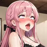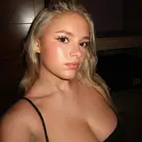
First of all, ignore the model featured, as this is a temporary edit used to show the format more than the final piece of art. For anyone who was wondering, she is an adobe stock image model #268951460.
Getting back to business, I am wondering which of these layouts would be the best choice for the remake. The vertical format would look great on a phone and fairly well on a PC too. The landscape would look great on a PC, but terrible on a phone.
The two separate images would have a few benefits: One, the images will be of a much higher quality since I wouldn't have to compress them. Two, it means there's no need to scroll to read the text on a phone (unlike the first two formats would likely entail). Three, the images are based on the same custom berry body, meaning that if you flick back and forth between them it would create the illusion of a video, thus the illusion of expansion!
Either way, at least you get to see another new piece of the remake. Feel free to let me know what you think of it, especially the text (I had a good laugh when I added Scarlett and her speech bubble to the second part.
Thanks as always,
Bubble-Boop
Bubble-Boop
2024-07-20 19:27:09 +0000 UTCRandom
2024-07-20 08:19:06 +0000 UTCNevoki
2024-07-19 20:09:41 +0000 UTCSweet Tea
2024-07-19 20:05:28 +0000 UTCRedSaiyan
2024-07-19 20:03:57 +0000 UTC