Which line-art style do you prefer?
Added 2024-06-03 18:01:57 +0000 UTC1:
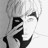
2:
Reason:
I didn't even pay attention on it until today, but I stopped to use the idle frames over the past updates. I wish to start using them again, and I decided to polish it a bit.
I made her lines thicker, all by hand, In all anime & videogames I always prefer when there is a thick black line-art - RIP pokemon games :( - But I don't know if it's the same for other people or if they prefer thin lines.
The idle images were 2160px, so in game their lines are thinner than other images, with make them less "visible" I think. But anyway, give me your thoughts.
Comments
I think for your current art style, the lines are plenty thick. Anymore may start to look strange.
BaddeToaster
2024-06-04 21:56:47 +0000 UTCI guess thinner, but I can barely tell the difference TBH
Blasty
2024-06-04 04:43:06 +0000 UTCI prefer thicker line work, makes the characters feel like they have more weight and makes them pop in a way I find appealing.
goDEVILvw
2024-06-03 19:04:13 +0000 UTCI always prefer thin lines. It gives the character a more "natural" look. Which is something I always enjoy.
TheOgreTheKing
2024-06-03 18:59:20 +0000 UTCThin lines for the outline against the background and thick lines on the inside world be perfect for me 😊
Simon
2024-06-03 18:55:52 +0000 UTCI can't really tell a difference except for the outside line giving her a profile. It made her look like ahe didn't fit into the scene. If that line wasn't so thick the rest looked fine.
tanktreads
2024-06-03 18:53:11 +0000 UTCimma be honest, i can barely see the difference.
PAVAGA
2024-06-03 18:23:44 +0000 UTCperhaps the lines that form the contour of the body like the second one, but those of the face and neck like the first (very thin or non-existent)
myumyu
2024-06-03 18:12:17 +0000 UTCI agree with Guy
Max
2024-06-03 18:10:45 +0000 UTCThick lines make the characters pop out too much from the background and the sharpness makes them look a bit harsher. The thin lines gives a softer, warmer look.
Guy
2024-06-03 18:07:47 +0000 UTC