How I love having Photoshop for the early stages of conception! It's so easy to just play around with bits of the image, and to switch back and forth between different versions to compare them.
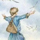
A lot of the things that work so much better in the second image here are, weirdly, things I consciously avoided in the first. I thought that having him hold up his hands would either make it look too pretentious or, at worst, like the Jesus statue in Rio. Turns out uplifted hands add so much to this!
The second is the wind coming from the land, as it's described in the excerpt. I had it come from the sea, to have him "fall" on it (though I'll grant you that this is a baaaad, bad spot to fall on the wind). But the wind blowing back his cloak in the first draft was very much at odds with the movement of the birds; the movement here is more compelling and no longer ambiguous.
Finally, this one is a clear echo of "In Pain and Regret", still one of my favourite (as well as best-selling) pieces even though it's now nearly seven years old. The wind here makes a huge difference. In "Pain", everything pushes away from the sea. The waves and the wind seem to block Maglor's path as he braces against them, knowing he can never go back. By contrast, in this one, everything seems to draw Tuor across the ocean.
I'm not sure I'll stick to the sunset colours Tolkien described. They would serve well to make a great contrast to "Pain", but they'd also move this close to kitsch... Maybe I'll try out something warm but dull; a little like the very Rackham-esque colours I used in "Tears Unnumbered".