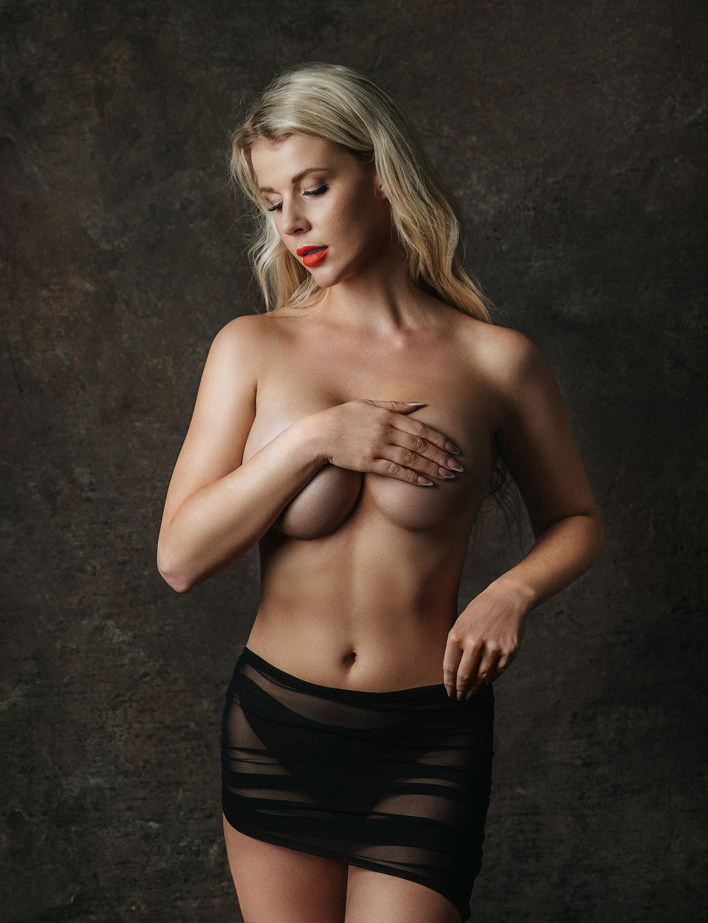


Our fellow photographer, Milan, sent his last photos for Critic's Corner. And look at this, it's a pretty good and confident job! Problems? Composition.
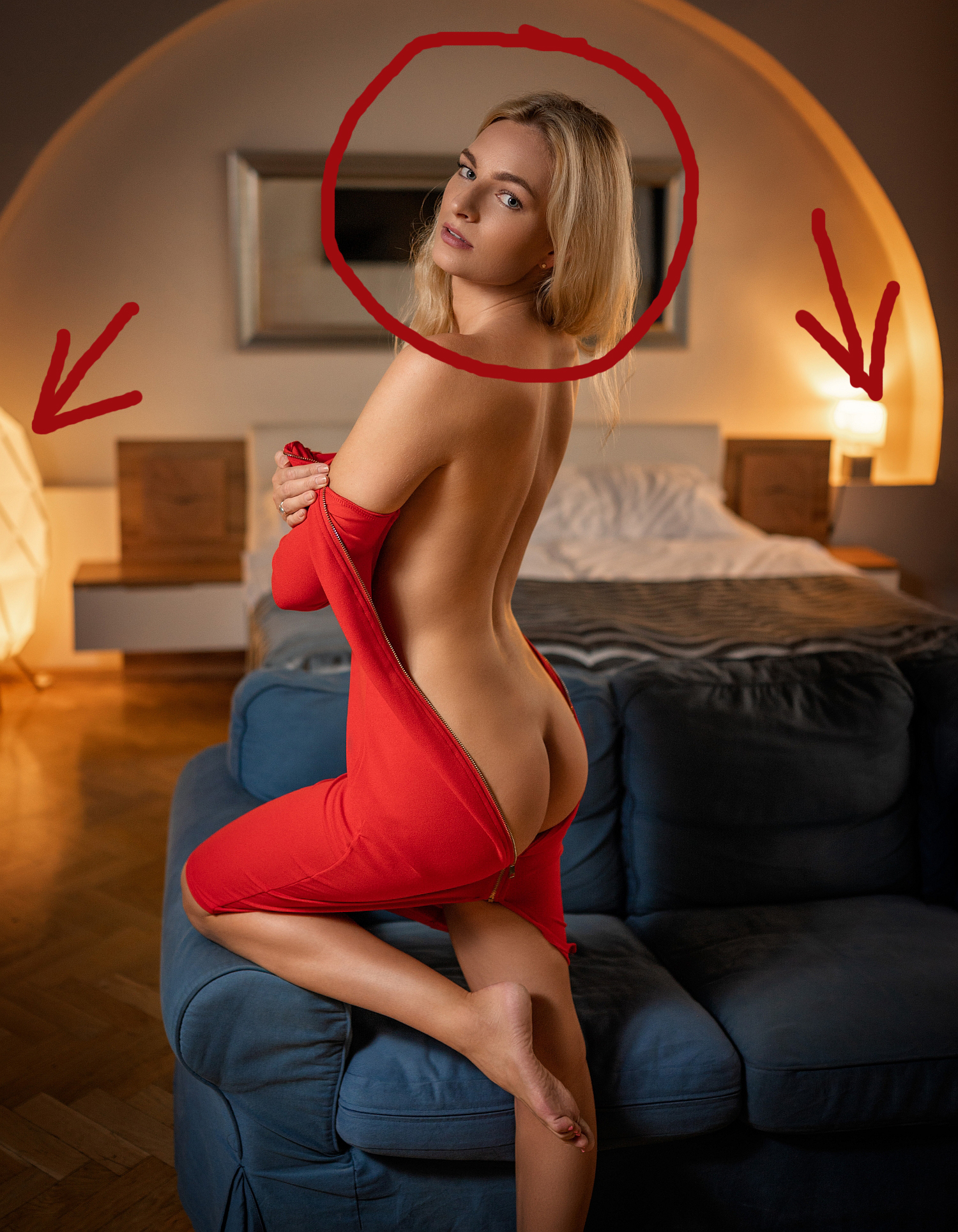
a) I believe you have to focus more on the model. And here we have two bright lamps in the background. Why? That distracts us from model's face, it's too dark.
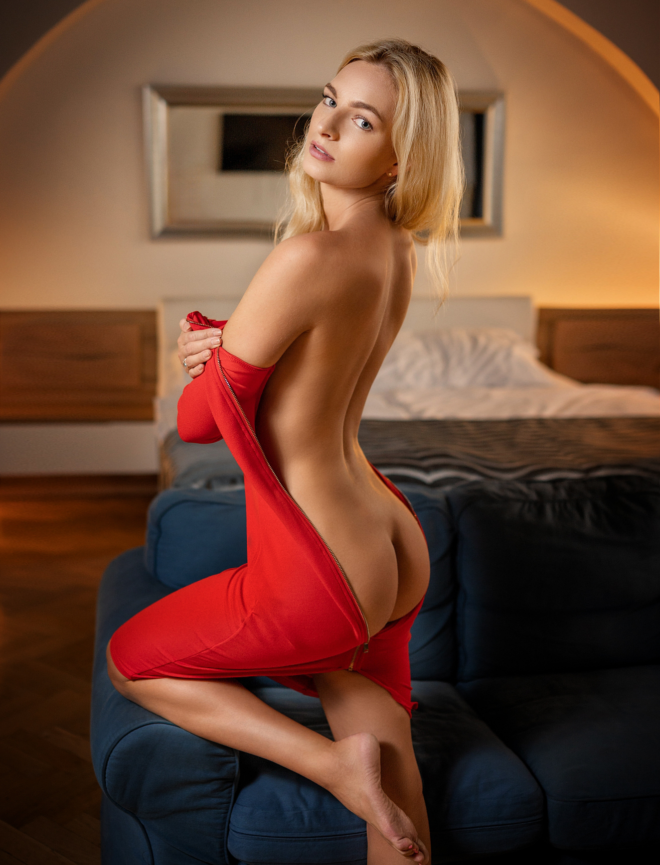
I tried to improve this. No bright lamps, more light and focus on the model. What do you think?
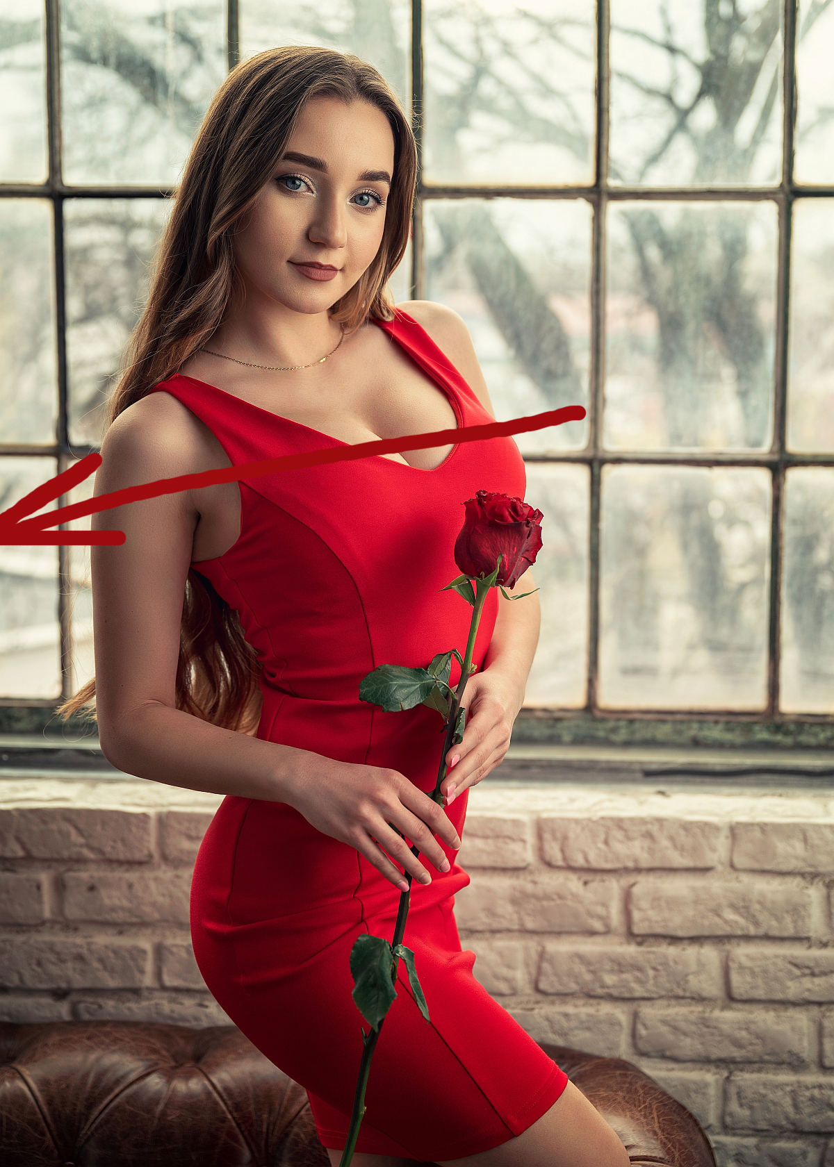
b) Too much empty space on the left, model is falling out from the frame.
Simple edit:
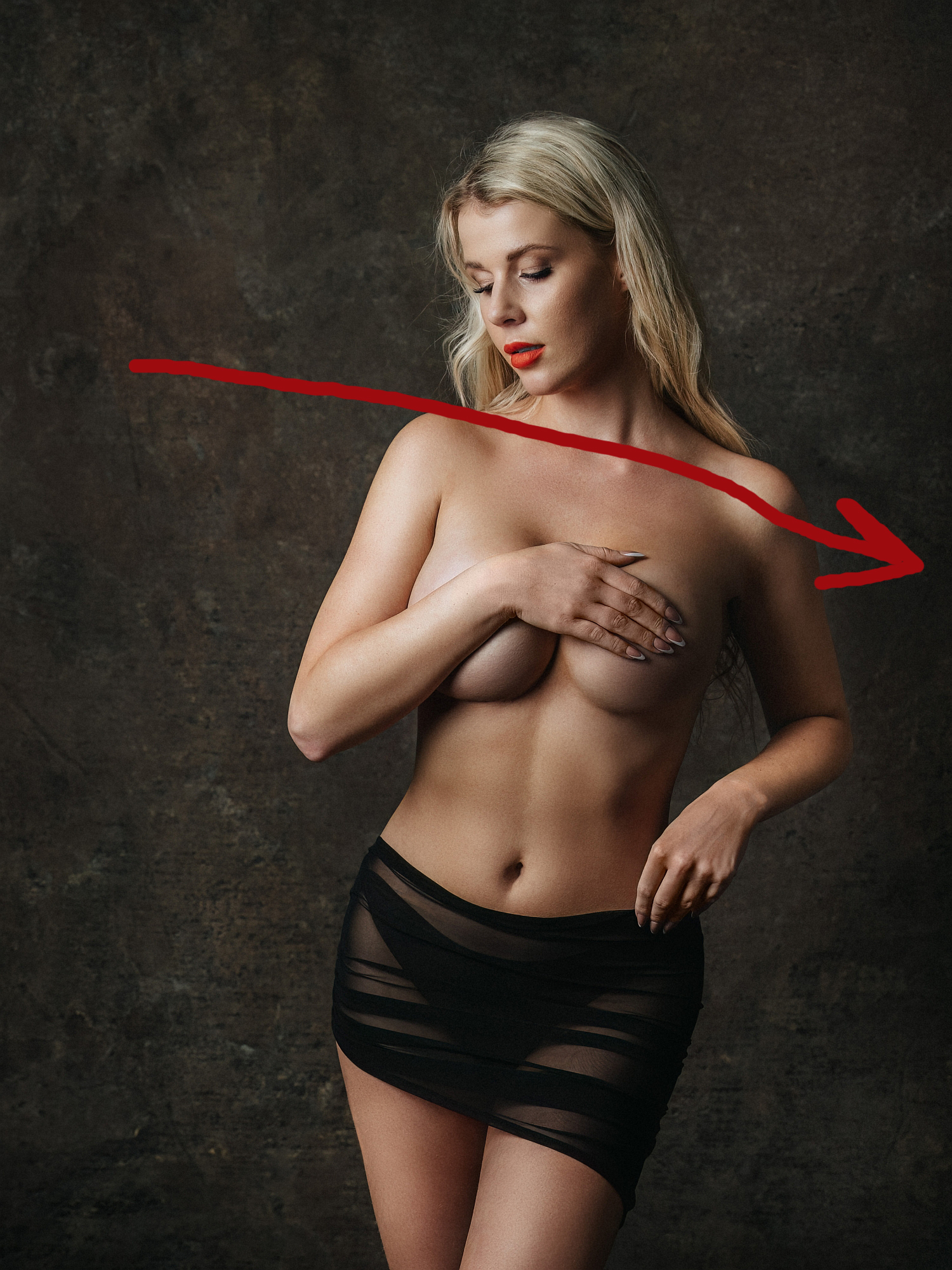
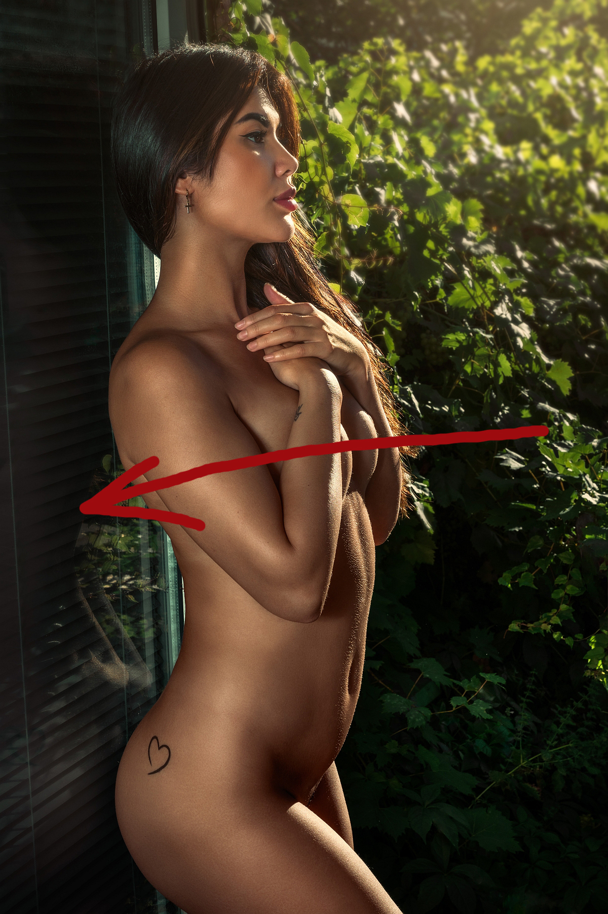
c) The same problem. Too much empty space on the right, model is falling out from the frame.
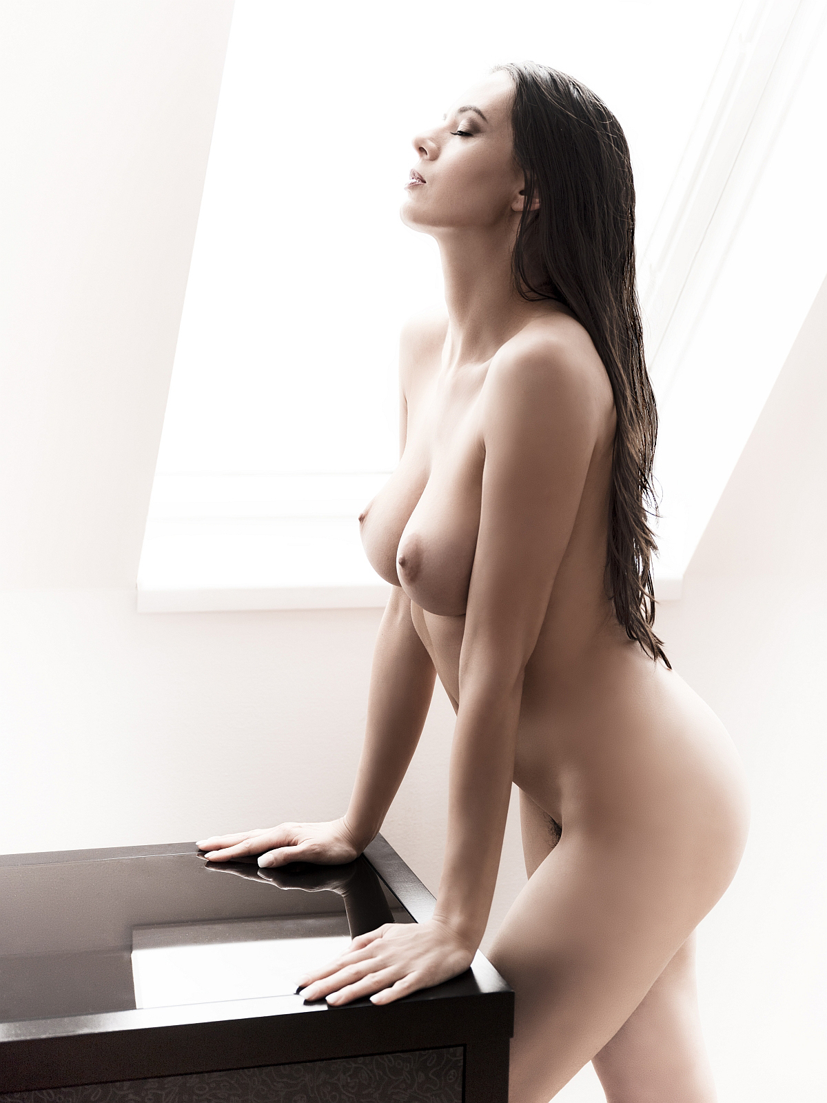
d) Composition again.
e) Again.
f) Let's try more cinematic crop here. Before:
After. What do you think?
g) And again, we can focus more on the model, less empty space on the left.
After: