My Art Process: Digital Work
Added 2021-06-14 17:59:31 +0000 UTCGood morning Starshines! The earth says hello.
It's been a while since I've had a blog post specifically for you guys, outlining my process on creating the pieces I create. I'm trying to do these a little more regularly, and I especially hope to have a few more on my current cosplay builds. But as I was streaming this past week, I decided it'd be a great idea to give you guys a breakdown of how I go about creating most of my digital work. This is a text and image heavy post, just fair warning.
Let's get started!
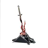
For this example I decided to use one of my most recent commissions, as I managed to save (most) of the steps for client review, and actually kept them on hand.
The main program I use for my digital art nowadays is Clip Studio Paint. It's an affordable, and more robustly art centered program than Photoshop. I recommend it highly if you're looking to get into, or practice your digital art. Clip Studio is more curated for illustrators and comic artists, unlike Photoshop. Photoshop may be more versatile in the range of things it offers, such as photo editing and manipulation, it tries to do too many things, and just doesn't offer the amount of resources that Clip Studio does to illustrators and comic artists, and for a fraction of the price. Clip Studio Paint also goes on sale several times a year, and you can get the whole program for a one time purchase as low as $25 USD. Check out their site for more details. (I promise I'm not sponsored LOL Though I probably should be.)
Advertisement aside, the first thing I do before starting any work is to open the program (ain't getting anywhere without that) and set up my canvas.

This is an example of my typical dimensions and set up for an illustration. I used to work primarily on 9x12, but since I have some current limitations on digitizing my traditional media work, I decided to keep everything consistent and switched to an A4 format across digital and traditional media. This paper size is a little more common in Europe, but ya know.
For this particular commission, however, I used a 6x8 canvas, since it reflects the size paper I use for portrait and waist up pieces in traditional media. But I always work with at least a 300 DPI resolution. This allows my work to be printed at larger sizes without any distortion, but also gives me a bigger resolution canvas to really toy with, and play with larger brushes without sacrificing detail!
I also make sure to set the background color of my canvas to a light-medium grey. This is much easier on the eyes than a pure white canvas, especially when working on bright screens such as my laptop or tablet. (My eye sight already sucks, why make it worse? Looool) Though this sometimes can cause a problem with colors, which I'll get to later.
When blocking out the base sketch, I've started leaning toward using a pencil tool. Clip Studio has a default tool I've really come to like for that. It's the Real Pencil tool, and I use it at a size anywhere between 20-35 pixels depending on the size of the subject of the sketch, in a blue/grey color.
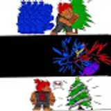
I always start with a gestural that winds up looking something like this

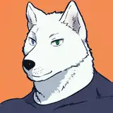
You can even see some of the quick studies I did of a monkey's face in order to familiarize myself with their proportions and anatomy. The others were on a separate file I didn't wind up keeping. Oops. Anthropomorphic characters aren't something I have the opportunity to do much of, so I wind up doing a few quick studies and sketches of the animal in question so I better know how to better stylize them. Or ya know, draw them in general. Whomp.
The pose is really loose and vague, just laying down placement and figuring out proportions and how it's going to flow. This really vague gestural process can go through many revisions before I start adding in details. But once it's nailed down, I can start embellishing and tweaking anything that doesn't fit right. This is actually one of the longest stages of my process because I'm having to build the piece from the bare bones of my foundation. It's the muscles over the skeleton, and I have to make sure the ligaments are pulling right before I can add the skin. And have you ever seen an anatomy text book? Muscles are detailed af.
Anyway, I end up with something like this:

As you can see, this piece went through a NUMBER of changes before I -- Nah I'm just kidding. I didn't actually save this stage of our monkey friend, and didn't have the original file on hand at the writing of this post to grab it. So I borrowed one from another commission I'm currently working on. But you get the idea! Back to your regularly scheduled MONKE.
My next step is to go over the sketch and further hash out the details, and really define the lines I want to keep before inking. This may sound like a bit of extra work, and honestly, it usually is, and adds even more time onto my process. But it honestly is really helpful, and I waste less time trying to figure out what I really meant with a line while I'm inking. It also helps me to better map out details and stuff like patterns on armor and accessories.
I use a smaller brush size of my pencil brush, and a pink or red color to help it stand out. So I wind up with something like this:

And now we're ready to ink.
This stage is pretty self explanatory. I really like my bold, thick line art, so I use the default G-Pen tool in Clip Studio, and use a brush size of 7-10 pixels. (Usually 10). It gives me a great differing line weight, and the stabilization as well as the brush itself gives me such a sharp clean line. I love it.
At the end, he looks a bit like this:

This is also one of my favorite stages, because inking is just so therapeutic for me both digitally and traditionally. Because I already have my sketch really defined, I can just turn my brain off and go while still accomplishing something.
But now that my lines are done, I throw on the flat colors:

As I mentioned before, the grey background I use to reduce eyestrain can really play hell with the perception of the colors that I'm using. And honestly? That's a whole blog post on it's own. But tl;dr, colors talk to each other and influence the way they're read by the eye and brain. So I find myself constantly toggling between a grey and white background in order to make sure everything is reading correctly, and is actually dark/bright enough. Or even sometimes just the correct color! Here is the version with a white background so you can see for yourselves the difference it makes. YAY COLOR THEORY!

The flat colors can often be a kind of ugly stage, because it's the base for which I build my highlights and shading. So sometimes, the colors don't always look so harmonious or can often blend together, As I mentioned before, colors talk to each other, so by the time I'm finished the base color can sometimes be overpowered, or even resemble another color entirely as it blends into the shadows and highlights.
My shading process is another pretty intensive step and can take longer than the sketch. Don't ask me why! It just does. RIP.
It's also another stage I could go more in depth in another blog post! But to give you the basics:
First I make a new layer and mask the area outside of the line art and the area I want to color. This keeps everything contained to where I want it, and if I have to fill large areas, it won't show in the area that's masked should I color outside the lines.
I set the layer style to either "Overlay" or "Hard Light" depending on the kind of tones I want achieve.
Then I use the G-Pen with a larger brush size and a dark color (usually red or purple) and start filling in the shadows. Once I get a good start, I toggle the layer opacity based on how harsh I want the shadows
I use the blend tool to soften some of the edges of the shadows, especially around curves
Highlights are started the same way, but I use a layer style of "Add (Glow)" or "Glow Dodge", and alternate between the g-pen and the soft airbrush tool.
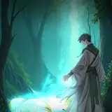
And then I add the background!
So then we wind up with a finished product of

TADA!
And that's the extent of my digital process! My traditional media process is mostly the same starting out, and I will have a post on that soon! I hope you guys enjoyed this read, and hope it gives you some ideas to build on for your own work. :)